Sport Aesthetics: The Kit
Posted on 13 Feb 2012
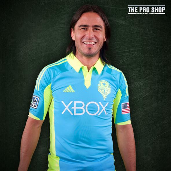
Sport is primarily a visual medium, and as such, sport production values should be placed alongside film and print and attended to with care and discretion. The Academy Awards rate and reward great work in costume and set design because how the actors look and where they act are important to the experience. Gotham City must be dark, and Batman cannot have nipples. The MLS policy that encourages the development and use of new (and ugly) kits every couple years, to me, indicates a lack of this understanding; a lack of care for a team’s legacy and identity. Certainly, jersey sales account for significant income for the teams and a new kit will sell better than an old one, but when this comes at the expense of class and custom, more is lost than gained. Case in point: the Sounders FC new third kit below. This kit causes eye strain. This kit is not going to be enjoyable to watch. People smirk when they see it. A kit should never be a distraction.
I have an emotional connection with my beloved team’s kit. My mental replays of goals and tackles and saves are dressed in that shade of green and blue. My memories of this kit should not be how bad I felt for the players who had to wear Skittles. The Lakers haven’t significantly changed their kit and logo since the 1960s. The legacy of that highly esteemed franchise is classy, not insecure and hokey like the Warriors who incidentally have changed their logo/kit six times in the same period. We voted against those trivial names they offered us—Alliance and Republic if I recall—because they had no meaning, no history. If the Seattle Alliance had orange kits there would have been a few thousand less fans on opening day. (It seems the MLS is learning that a fresh start for a club and city is not necessarily best; Portland was allowed to use the Timbers name straightaway). When a new player sits down for their first interview they almost always remark on their new surroundings, the city, and the legacy of the club. I am emotionally joined with our new starting striker the moment he dons the green and blue scarf and the flashbulbs pop. I love that shit. I have no idea what team Mauro is playing for here, but I am sure they are cheap and sucky.
An attention to aesthetic is not only for the kit, but the field, the stands, the scoreboard, the graphics, the advertisements, which all serve the beautiful experience of the beautiful game. When a soccer team plays on an NFL branded pitch, it looks wrong. When Sigi is wearing a sweatsuit to a match, I wonder what he makes a season. When the team hands out 10,000 inflatable noise-makers, I wonder if we know how to cheer. The NBA has rules about the players’ attire when they walk from the bus to the locker room. They look classy and expensive, not like junior highers. The NBA understands this (too bad they have little sense of game flow experience as seen in the obnoxious scoreboard cheer-leading the Sonics were dropping between every possession change). Now, before I err in the direction of draconian measures, I put equal expectation on Sigi to look good. Just because the league doesn’t enforce attire doesn’t mean he shouldn’t want to appear professional. And credit the Sounders organization for acknowledging the gaff with those damn noise-makers, and letting us write-in “Sounders” for the name.
I’ll get over this SuperCyan™ kit; it will only be used a dozen or so times ever, sadly in CONCACAF play.
Got something to say?